Kathe Fraga · Painter · Currently at JG Art Gallery
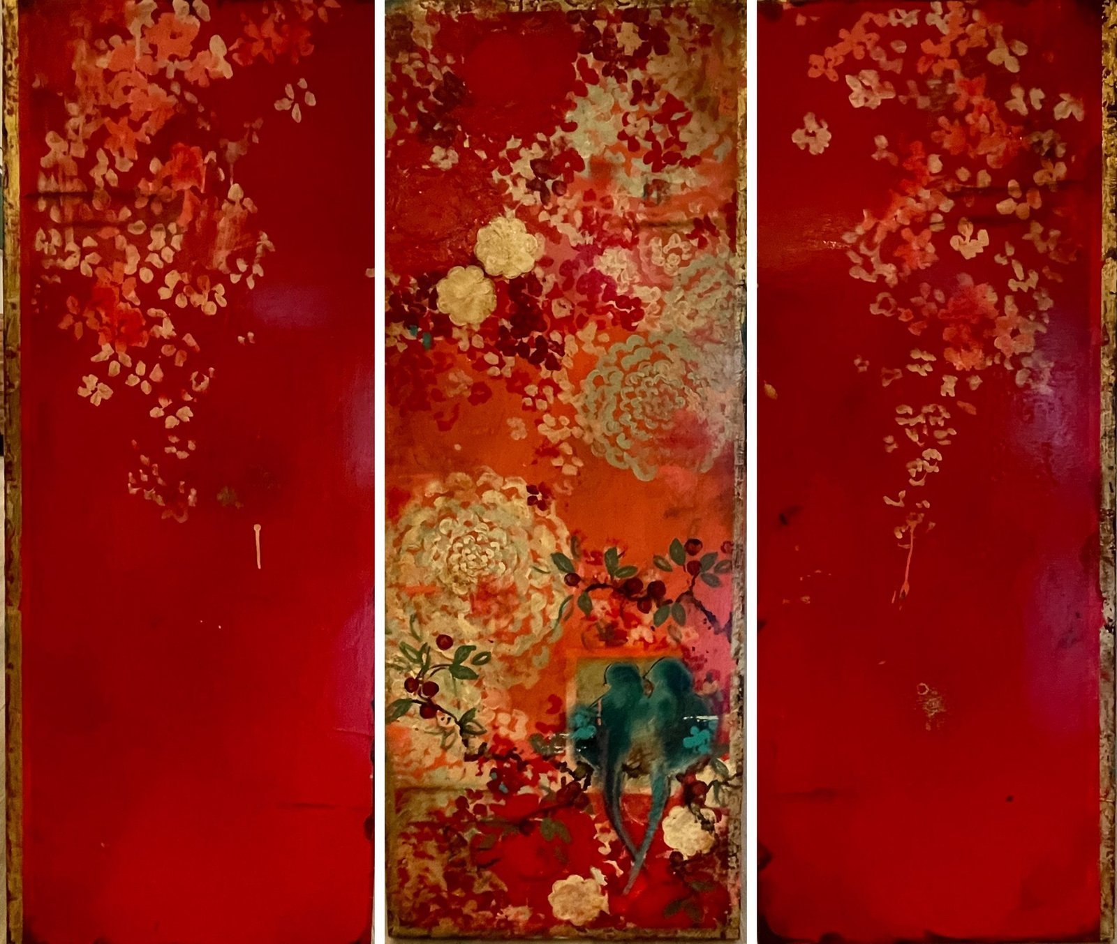
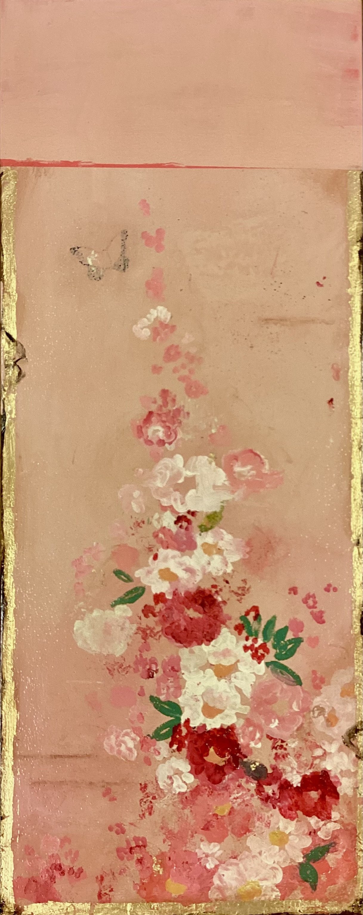
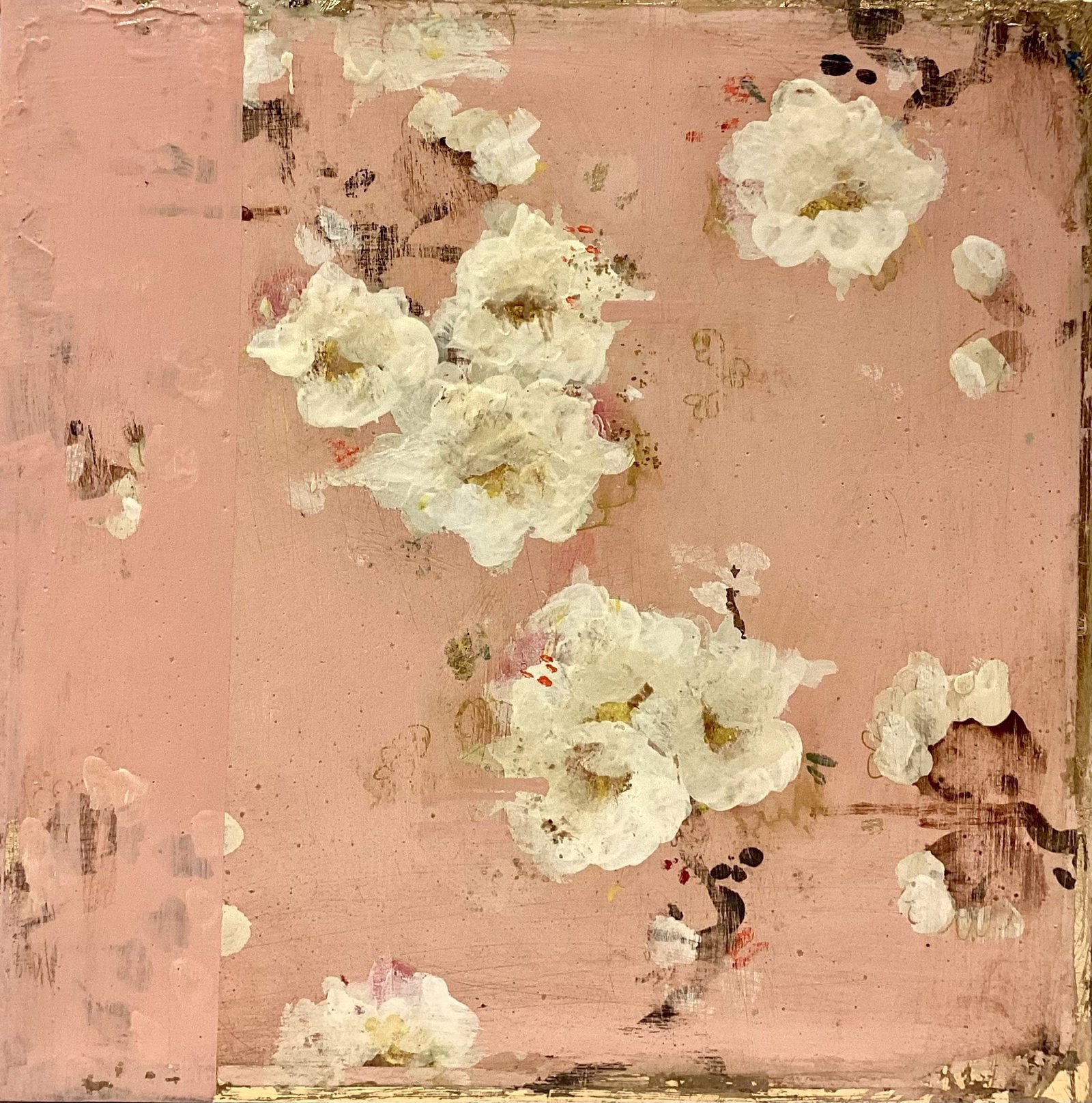
Chinoiserie — the European decorative tradition born in the 17th and 18th centuries, when French and English craftsmen invented a fantasy version of China layered onto wallpapers, lacquerware, silk, and porcelain — is her subject and her structure. The tradition runs from Boucher and Pillement through Delft tile and Chippendale furniture; the MET’s 2015 exhibition “China: Through the Looking Glass” was the highest-attended show in the museum’s costume history and directly inspired her 2017 collaboration with Clé de Peau Beauté. Fraga’s specific contribution is the surface: acrylic with gold ink and gold leaf applied to a frescoed birch panel, then sealed with a glossy lacquer glaze. The fresco ground — powdery, slightly rough, reading as aged plaster — is what separates her work from other Chinoiserie-inspired painting. The surface already looks like a wall that has been there for two hundred years. In Roses Are Red, The frescoed birch ground displays a chalky, mineral finish—a powdery plaster skin through which cadmium orange and deep alizarin reds bleed and pool unevenly, creating zones of saturated color interrupted by bare, scraped patches of raw wood. Gold leaf and gold ink scatter across this damaged surface in two registers: dense, almost suffocating clusters of schematized peonies and plum blossoms in the upper reaches, and larger, more legible chrysanthemum and rose forms in the lower center, their metallic outlines catching on the textured ground like paint catching on gesso. The lacquer sealing compounds the friction between Chinoiserie's imperial ornament and the work's deliberately compromised surface—the gloss trap reflects back not refinement but oxidation, making the traditional botanical repertoire appear archaeological, as though these motifs were being recovered from beneath layers of time rather than freshly applied. In Moonlit Dream, The surface presents a deliberately weathered fresco ground—chalky plaster in rose and cadmium tones layered beneath a teal-blue field that mimics aged pigment, its matte finish interrupted by deliberate crazing and paint loss that reads as temporal depth rather than damage. Gold leaf and gold ink occupy the upper register with archaeological hesitancy, defining a circular moon form and decorative borders that sit *on* rather than integrate into the plaster, their metallic sheen emphasizing their status as applied ornament. Pink and burgundy botanical clusters—rendered in a flat, almost stenciled manner—cascade and scatter across the abraded ground, their powdery quality matching the friable surface below, anchored by a single figure wearing a gold halo-like shape at the composition's center. The fresco technique destabilizes the Chinoiserie vocabulary: rather than projecting the exotic refinement such imagery traditionally promises, the peeling, stippled ground converts these garden motifs and gilded decorations into artifacts of their own commerce, acknowledging how such imagery has been layered, scraped, and reapplied across Western visual history. In Beloved, The frescoed surface presents a deliberately compromised plaster ground—chalky, abraded, and mottled with exposed underlayers in ochre and pale yellow—against which gold leaf sits unevenly, catching light in broken patches rather than as coherent ornament. Botanical clusters in cadmium red, rose madder, and prussian blue occupy the composition as discrete, almost collaged elements, their delicate sprigs and blooms rendered in fine detail yet floating free of the scratched and worn background. The fresco's deteriorated quality works against the Chinoiserie tradition's artifice: instead of timeless refinement, the work registers as archaeological, its precious materials and Eastern motifs subjected to a temporal logic that insists on decay and surface rupture. The tension she introduces — a bold swath of cadmium red against a delicate branch of soft pink blossoms, the modern loud against the vintage quiet — is the move that makes the work more than decoration.
Her paintings have been featured in VIE Magazine (three-page feature, October 2019), Luxe Interiors + Design Pacific Northwest Edition (“Style Maker,” 2013), Better Homes & Gardens (May 2013), Seattle Magazine (March 2011), and international design publications in Mexico, Turkey, and Malaysia. She collaborated with Clé de Peau Beauté (Shiseido) on the 2017 “Nuit de Chine” limited-edition holiday collection and with Papyrus Cards. Her paintings have appeared on set in The Kominsky Method and The Office. Her work is in the collections of Swedish Hospital, Island Hospital, and Our Lady of the Lakes Hospital in Baton Rouge, and she created wine list books for the Inn at Langley. She cites Klimt, Chagall, Matisse, Bonnard, and the French textile designer Paule Marrot as influences, alongside Japanese Ukiyo-e woodblock prints.
My paintings evoke the hand-painted, timeworn walls of a grand old Parisian mansion, each piece resembling an aged decorative panel adorned with birds and flowers, vines and leaves in a modern Chinoiserie style. Color reacting to color is a big influence. It’s exciting to paint a bold wide swath of red and then layer it with bright orange and then add a subdued branch of soft little pink blossoms to create a surprising mix of modern and sweet, small detail.
Kathe's practice, in detail.
Formation
- BackgroundNaval family — both US coasts, South America, EuropeQuito · Paris · Copenhagen · London
- EducationUS International University — Sussex, EnglandUniversité de Grenoble — France
- DegreeUniversity of Washington — Seattle
- CareerAdvertising copywriter — Los Angeles, Seattle, Honolulu
- GalleryGallery Fraga — Winslow Way, Bainbridge IslandRan with husband Jeff for 6 years
Exhibitions & Collections
- BIMA"Revering Nature" Spring Exhibition · Beacon GalleryBainbridge Island Museum of Art
- OngoingJG Art Gallery — Bainbridge Island & Park City
- HospitalSwedish Hospital — Seattle, WA
- HospitalIsland Hospital — Anacortes, WA
- HospitalOur Lady of the Lakes Hospital — Baton Rouge, LA
- CommissionInn at Langley — wine list books for world-renowned dining room
Press
- 2019VIE Magazine — three-page feature, October 2019"One Brush of Color at a Time"
- 2013Luxe Interiors + Design — Pacific Northwest Edition, "Style Maker"
- 2013Better Homes & Gardens — May 2013
- 2011Seattle Magazine — March 2011
- IntlCasas & Mas (Mexico) · Maison Française (Turkey) · L'Officiel (Malaysia)
Collaborations
- 2017Clé de Peau Beauté (Shiseido) — "Nuit de Chine" limited edition holidayInspired by MET exhibition "China: Through the Looking Glass"
- TVThe Kominsky Method · The Office · Brooklyn 99Paintings featured on set
- CardsPapyrus Cards — two collections
- WineFletcher Bay Winery — label art for "Tara Rouge"
Critical Context
- TraditionChinoiserie — 17th–18th century European fantasy of ChinaBoucher · Pillement · Delft · Chippendale → Fraga's modern fresco version
- TechniqueFrescoed birch panel — powdery plaster ground reads as aged wallAcrylic + gold ink + gold leaf, sealed with glossy lacquer
- TensionBold cadmium red against delicate pink blossom branchesModern interrupting the vintage — the loud against the quiet
Influences
- PaintersKlimt · Chagall · Matisse · Bonnard · Paule Marrot (French textiles)Japanese Ukiyo-e woodblock prints
- SourcesVintage French wallpapers · 17th–18th century Chinoiserie patternsFather's silk kimono from Japan — founding visual moment
- Place110-year-old Bainbridge Island stone house by the seaOld fir floors, forest light — daily reminder of time and patina
As featured in.
Selected works.
A current selection from Kathe's work, available through JG Art Gallery. The gallery responds within one business day with placement, dimensions, and indicated price for the work in question.

The gallery responds within one business day.
For current availability, pricing, or to commission new work, write directly. Worldwide shipping, payment plans, full provenance documentation.